Huggies 2.0
A phone-first, editorial rebuild of the Huggies site. One content model and the design system's brand modes run Huggies, Pull-Ups and Depend from the same code.
- Client
- Kimberly-Clark
- Year
- 2026
- Role
- UX Design, Interaction Design, Front-end Development
- Stack
- Next.js, React, TypeScript, Tailwind CSS, Motion, Figma Variables
Live prototype — scroll, tap and navigate inside the phone.
Challenge
Parents on a phone have one job: find the right diaper, in the right size, and somewhere to buy it.
A credible v2 had to prove three things at once — that the same content could feel far more focused at phone width, that the full shopping path still worked end to end, and that one design could stretch across brands with very different fonts, colors and product lines without forking the code.
Process
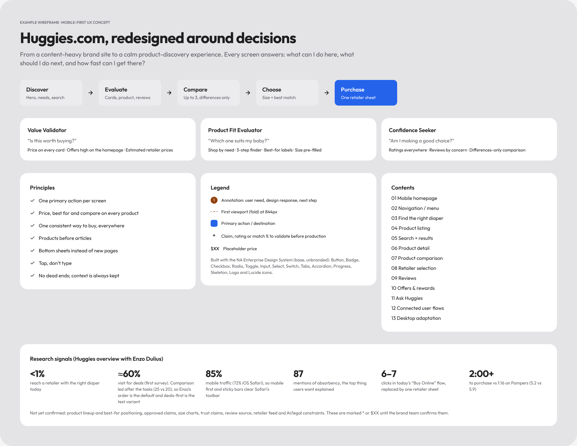
Before any pixels, I mapped the site around the decisions parents actually make.
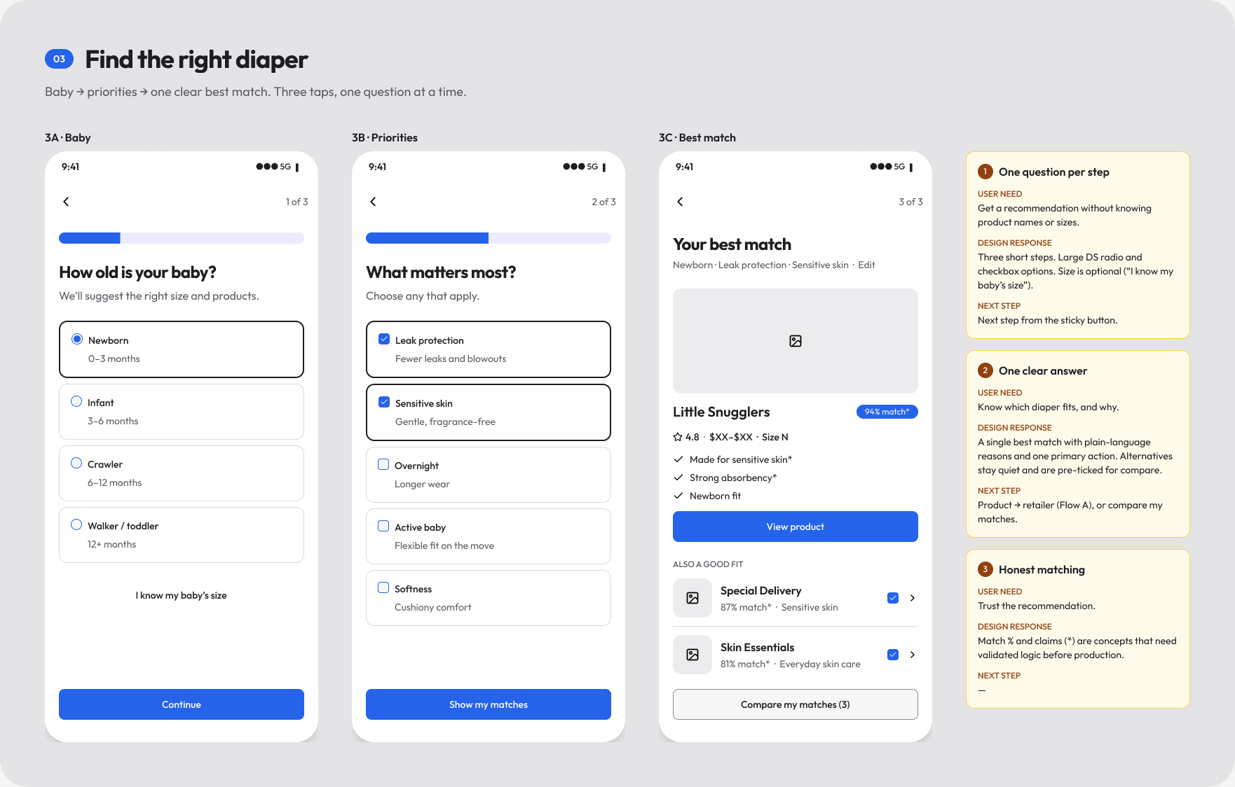
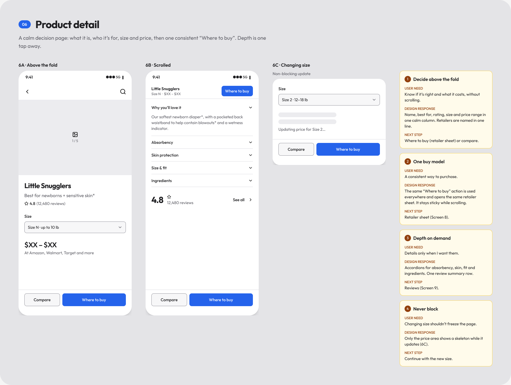
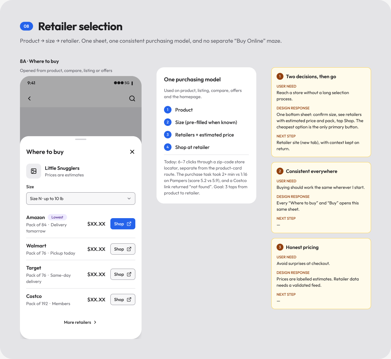
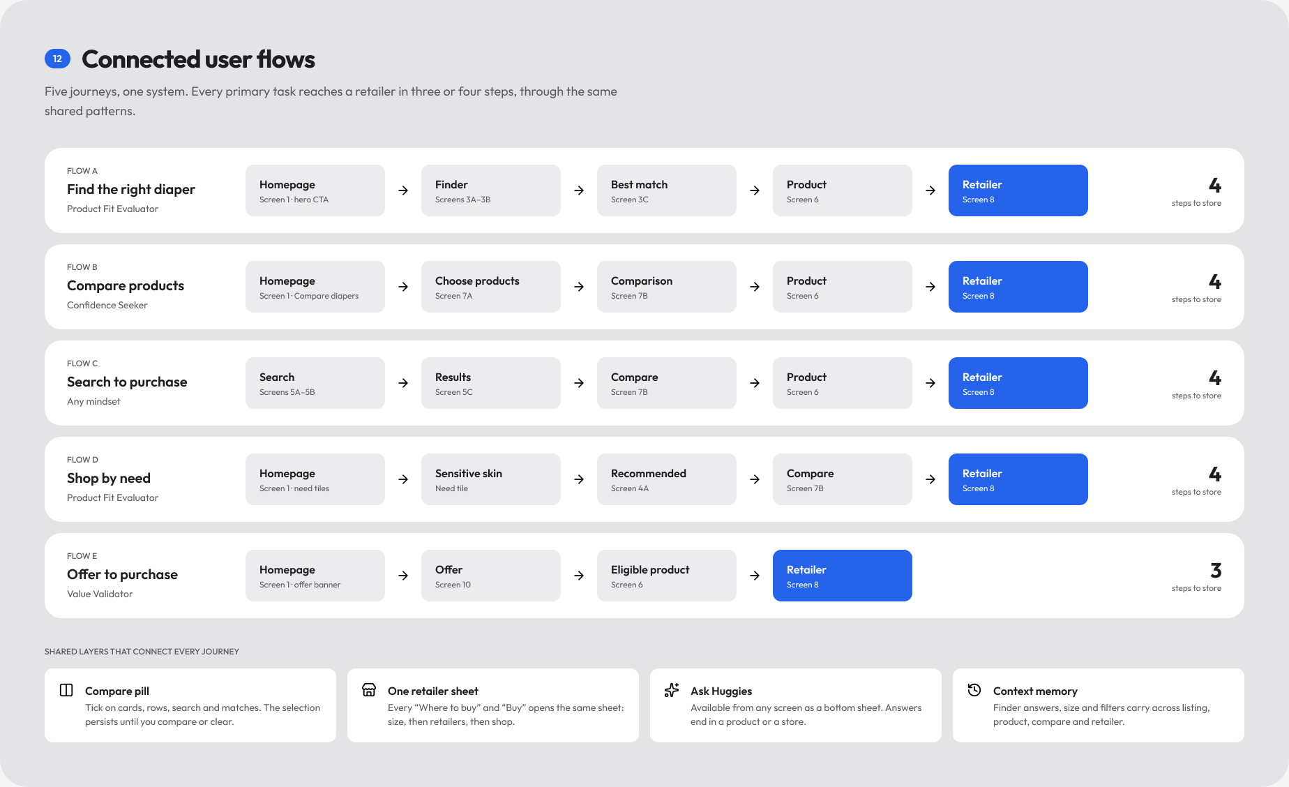
The research was blunt: under 1% of visits reached a retailer with the right diaper, 85% of traffic was mobile, and today's "Buy Online" flow took six or seven clicks. So the brief became a path — discover, evaluate, compare, choose, purchase — and three mindsets to design for: the Value Validator ("Is it worth buying?"), the Product Fit Evaluator ("Which one suits my baby?") and the Confidence Seeker ("Am I making a good choice?"). I wireframed fifteen phone screens in the enterprise design system's unbranded base, so the structure was argued on its own before brand styling arrived. Every screen carries numbered annotations — the user need, the design response and the next step — and a short set of principles kept them honest: one primary action per screen, price and best-for on every product, one consistent way to buy, bottom sheets instead of new pages, and no dead ends. A connected-flows board then proved the system: five journeys, each reaching a retailer in three or four steps through the same shared patterns. From there the homepage went through two hi-fi passes in Figma before I built it in code.
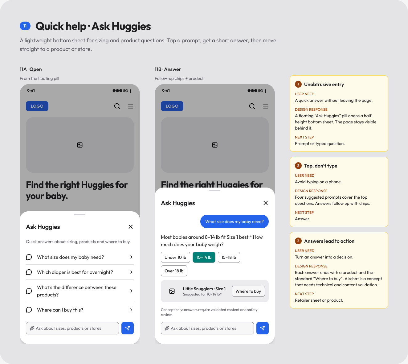
Wireframe to hi-fi
The homepage's first two screens across three passes: the annotated wireframe, a first brand pass, and the calmer editorial direction that shipped in code.


Approach
I kept the original information architecture and content object, and redesigned how it reads.
The homepage is mostly air: a large centred headline whose words land out of a soft blur, two clear actions, and a photograph that opens like a curtain. A size finder lets parents drag a weight slider while the pack grows to match, and the size they pick carries straight into "Ready to buy" further down the page. Ticking two or more products raises a compare tray that opens a side-by-side sheet showing only the specs that differ. Behind the homepage sits the rest of the path, built in the same language — listing with filter chips, search, a product page decided above the fold, a quiz that goes from baby to priorities to one best match, reviews framed as "Is it good?", offers and where to buy — all reachable from a floating menu dock, with pages sliding in from the side as you move forward. Brand identity comes from the "Brand" variable collection in the NA Enterprise Design System Figma file, exposed as tokens, so each product and tile can be tinted from its brand's own palette. For reviews, the site runs inside a phone mockup with a brand switcher and page picker, so stakeholders see it at real phone width.
Outcome
The prototype runs all three brands from one codebase and covers the whole journey from first visit to retailer hand-off: homepage, listing, search, product, compare, quiz, reviews, offers and where to buy.
It turns the v2 conversation from static mockups into something people can hold in their hand, and shows the design system's brand modes doing real work in production-grade code.